
Expert Tips for Choosing the Best Neutral Paint Colors
When it comes to decorating our homes, one of the biggest challenges we face is choosing the right paint colors. With endless options available, the choices can be overwhelming. I originally penned this post back in 2019. Today I am completely rewriting it with current information and sharing expert tips for choosing the best neutral paint colors for your home.
Expert Tips for Choosing the Best Neutral Paint Colors
Whether you are searching for pure white paint colors, greige, cream, beige, or grays, the following tips will aid your search
Know Your Neutrals
Pure Neutrals
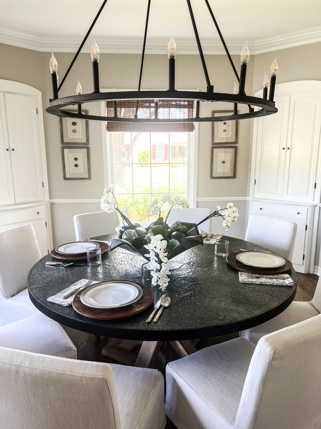
Black white, brown, and gray are pure neutrals. They are fully saturated and do not have an undertone. By mixing different pure neutrals and primary colors. When mixing pure neutral with primary colors you influence the resulting color’s saturation and vibrancy.
Near-Neutrals
Near-neutrals are achieved by micing a primary color with a pure neutral color. Near neutral colors have lower saturation than pure neutral colors.
Warm and Cool Neutrals
Mixing different pure neutral colors with primary colors creates either warm neutrals or cool neutrals. Warm neutrals have yellow, orange, or pink undertones, such as beige, tan, and gold, while cool neutrals have blue, purple, or green undertones, such as gray, taupe, and ivory.
Consider a Color’s LRV
What is LRV? Light Reflectance Value (LRV) measures the percentage of light a color reflects, with higher values indicating lighter colors that reflect more light, while lower values represent darker colors that absorb more light.
Kylie M Interiors has a great post explaining LRV in layman’s terms here.
Consider the Lighting
Light conditions are important. Be sure to consider the natural and artificial lighting in a room when choosing your neutral color. The amount of light a room receives will affect how a specific hue shows up. Bright, natural sunlight can bleach out a color, while a room with little natural light can make the hue more intense. In a room with a lot of natural light, neutral colors with cooler undertones, such as blue or green, often work best as they balance the warmth from the sunlight. In a room with very little natural light neutral colors with warm undertones can add warmth and coziness to the space, making it feel more inviting and less stark.
Give Thought to the Mood and Function of the Room
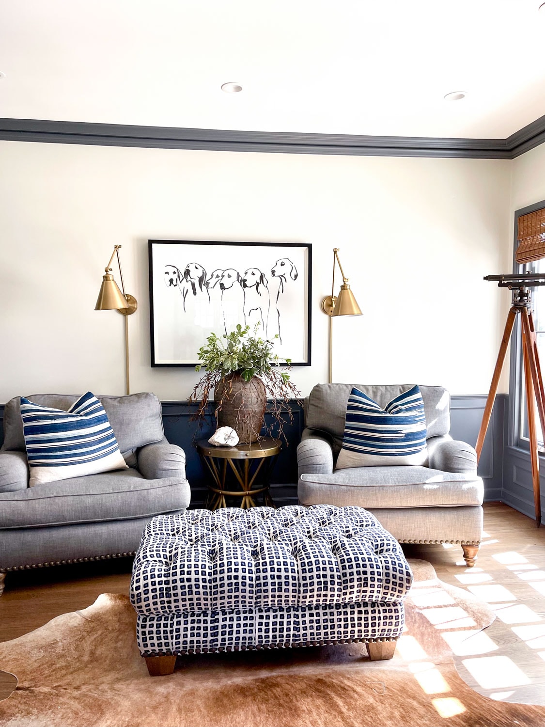
Cool neutral colors, such as light grays, soft blues, and cool whites, work best in rooms where a calm, refreshing, or modern ambiance is desired (bedrooms, bathrooms offices etc.)
- Bathrooms: Cool neutrals can create a clean, spa-like atmosphere, making the space feel more open and tranquil.
- Kitchens: These colors can provide a crisp, clean look, enhancing the room’s brightness and making it feel more spacious.
- Home Offices: Cool neutrals can promote focus and productivity
- Living Rooms: When combined with warmer accents, cool neutrals can balance the space, giving it a sophisticated and airy feel.
Warm neutral colors, such as beige, taupe, warm grays, and creamy whites, work best in rooms where a cozy, inviting, and comfortable ambiance is desired
- Living Rooms: Warm neutral paint colors can create a welcoming and comfortable space encouraging relaxation and socializing.
- Bedrooms: They can provide a soothing, relaxing and tranquil environment.
- Dining Rooms: Warm tones can make the space feel more intimate and inviting.
- Family Rooms: These colors make the space feel more homey and comfortable.
- Hallways and Entryways: Warm neutrals can make these transitional spaces feel more inviting and connected to the rest of the home.
Consider the Existing Furniture and Decor
The neutral paint color you choose should complement the existing décor and furnishings to create a harmonious and cohesive look. The wall color should serve as a backdrop that ties all the elements of the room together.
Expert Tips for Choosing the Best Neutral Paint Colors
My Favorite Neutral Paint Colors
When choosing neutral colors it’s okay to look for inspiration in a magazine, online, or interior designers favorites (like mine). These can serve as guidelines but color shades look entirely different online and in pictures. Consider the lighting, function, and existing decor before making any decisions. Try the color in different areas of the room. Many decorators suggest ordering large paint samples from places like Samplize. These are helpful but honestly the best thing to do (if you aren’t paying a painter) is to paint an entire wall before making a decision.

The above colors are favorites that I used for clients and in my former homes.
BM White Dove
BM White Dove is a warm white with creamy undertones. It isn’t stark or sterile. It is perfect in my opinion and my usual go-to.

We painted all of the rooms (for continuity in a smaller home) Benjamin Moore’s White Dove. This house had a lot of natural light and I loved White Dove in this application.
BM Monroe Bisque Cut in Half
Benjamin Moore describes Monroe Bisque as “rich, creamy ecru that balances the warmth of brown with the coolness of white, with a hint of honey”.
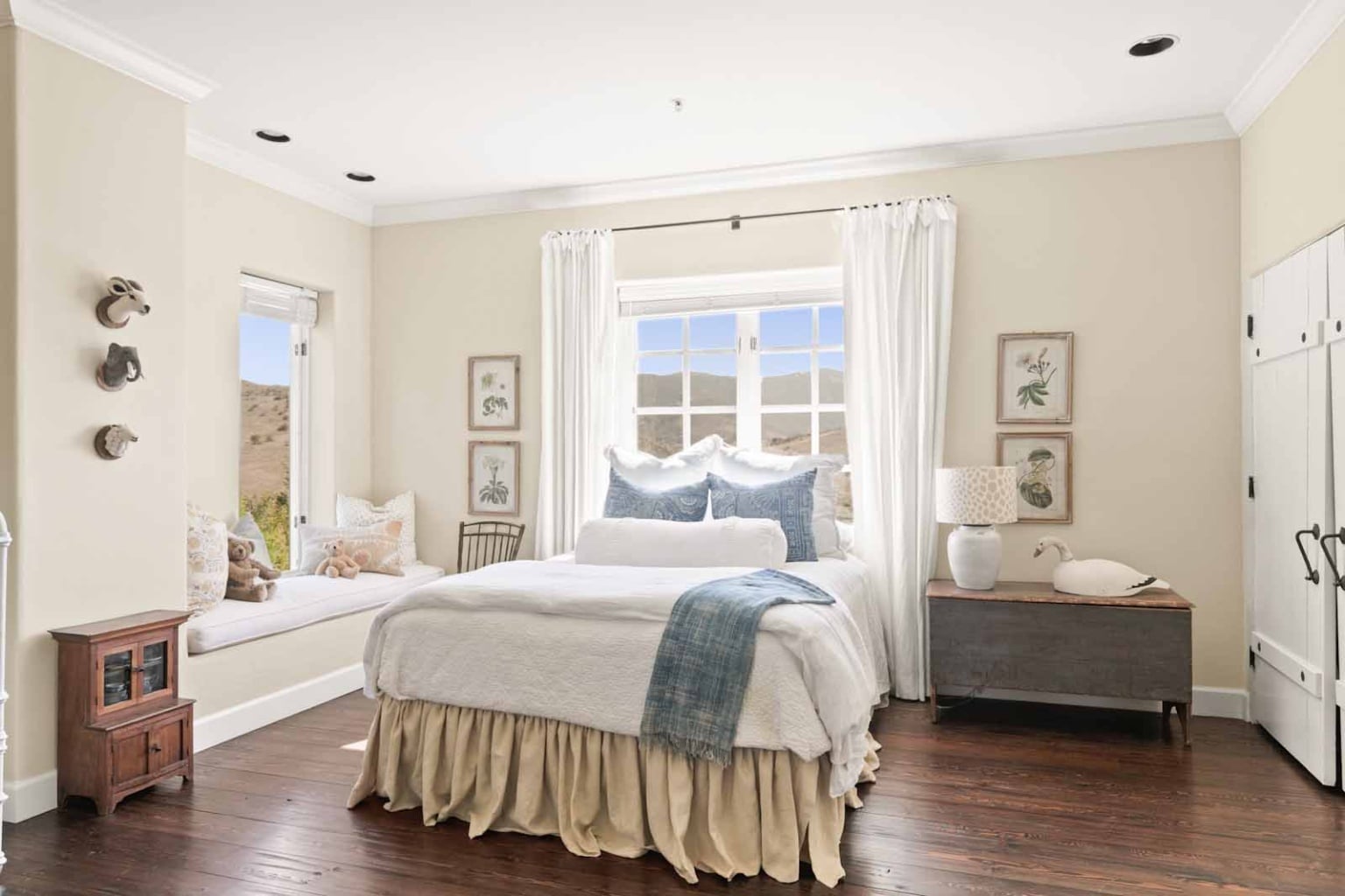
In our Chualar home when we converted one of our guest room to Summer’s room, I didn’t want to edit the entire space. I wanted to be able to use my existing furniture and decor in a more youthful way (without throwing the baby out with the bathwater so to speak). The trim is White Dove. This is a real estate photo (note the curtains).
BM Manchester Tan Cut in Half
This color for me is the most versatile a most often loved color (of clients). It is a “warm beige with green undertones”, which makes it extremely versatile

BM Manchester Tan cut in half in a project I completed in Carmel Valley several years ago. When we put it on the walls the clients weren’t sure about it. They ended up painting the entire house the same color. It is that good.
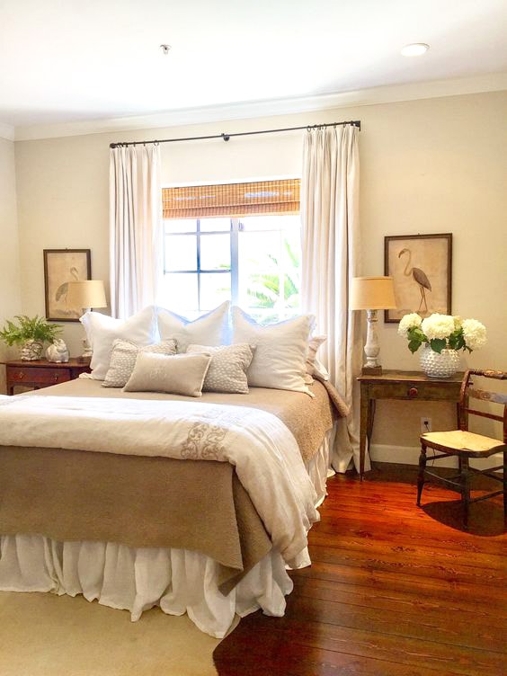
The same color in the guest room of our Chualar home.
BM Edgecomb Gray
The main floor of my son and daughter in law’s home is painted BM Edgecomb Gray. Here it is in a room with an eastern exposure.
Their dining room with a northern exposure is painted the same color. The trim is BM Simply White.
BM Halo
This color looks great in rooms with both warm and natural light. We used this in numerous projects.
BM Halo in my son’s library.
This photo is of our former guest room also in BM Halo.
SW (Sherwin Williams) Creamy
I don’t know that I would have chosen this color (in my opinion it is a little tricky). I included it because the main spaces in our present home are painted SW Creamy. SW describes it as a “bright white has the softest of yellow undertones.

BM Creamy (an off-white) in our current living room.
BM Simply White
BM Spanish White
Benjamin Moore describes Spanish White as is a warmer white with slight undertones of gray.
I strayed from my normal BM White Dove and used BM Spanish White on the main floor of our former home. I wish I would have gone with White Dove. Spanish White can take on a greenish cast depending on the lighting.
BM Spanish White in my former entry with less natural lighting.
By considering factors such as lighting, décor, undertones, and light reflectance value, you’ll be well-equipped to select the perfect neutral paint color that enhances your space and reflects your personal style. When selecting paint colors for your home have the paint store mix up several samples. Paint large samples in various areas of the room in different lighting. Check the colors at different times of the day before deciding.
Thank you for reading Expert Tips for Choosing the Best Neutral Paint Colors. I will be back on Thursday with my friend Kim for our monthly Signature Style Series. We will be talking about linen.
More Reading:
Architectural Digest Complete Guide to Choosing Neutral Paint Colors
Color Expert Maria Killiams Blog-full of information on selecting colors
Masterclass-What are Neutral Colors


it is all in the light . BM is a great paint. We just bought a gallon for our closet. At over $100 dollars a gallon we were joking that a painter should come with the paint.
Your photos are beautiful. Very inspiring!
Hi Cindy,
I know this post is a rerun (I spotted my comment), but I just have to say how much I enjoyed reading about the paint colors. For me, paint color is the most challenging choice in my home. When I moved into my current “cottage” I selected a throwback color by Dunn Edwards paints, Swiss Coffee. We painted all of the rooms that color and I’ve loved the clean fresh feel of it. I jazzed up my patterns and colors (mostly blue and white) in textiles and pillows for each space.
Thank you for reminding me of all the best whites.
Karen B.
Thank you Cindy – great info! I’m saving for future projects. Always a treat to see your past homes/projects. Love your style, and find it inspiring.
Very informative article! Very helpful!
Thanks
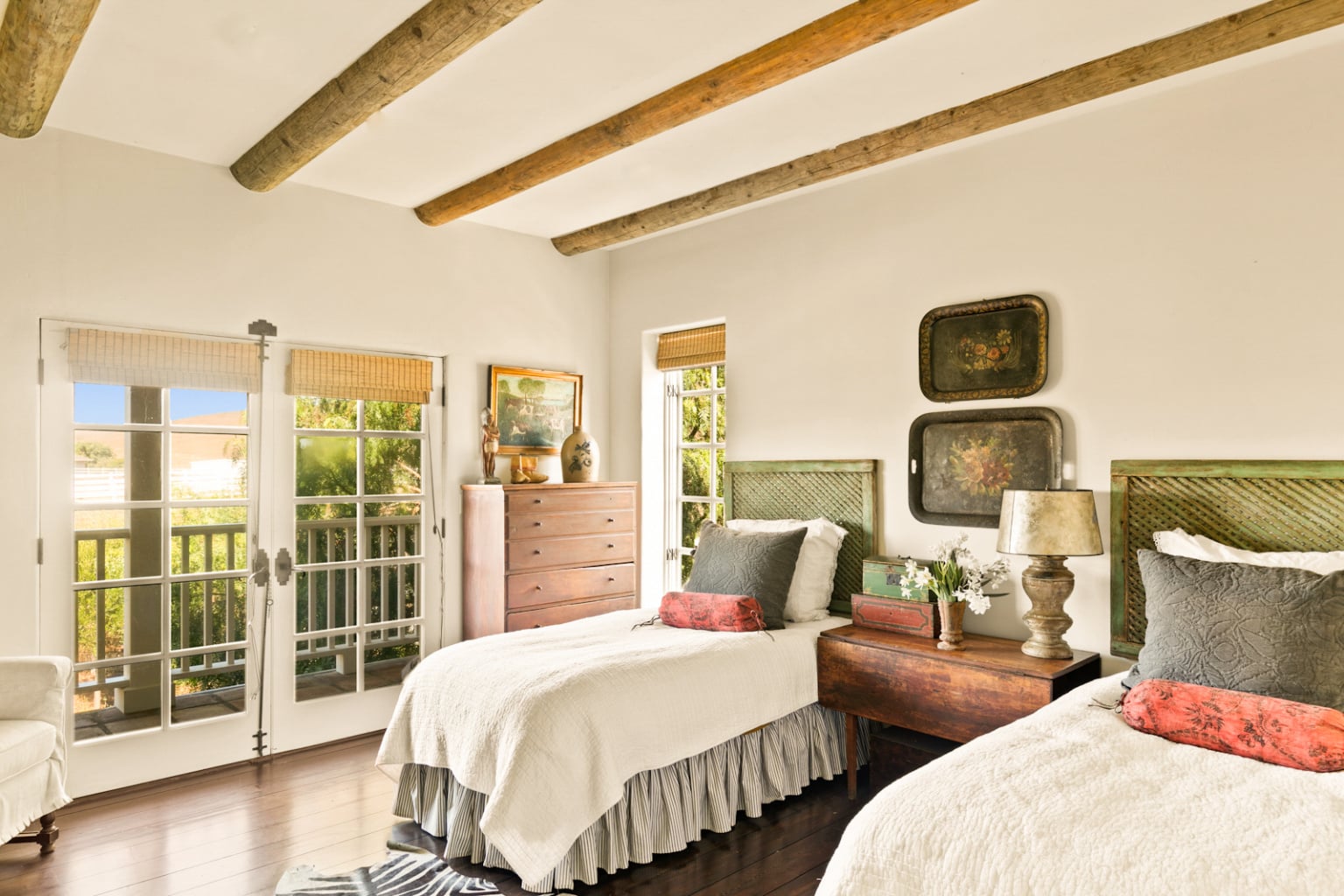
i used BM dove white for all my years in the design world. as walls and contrast trim. . it was wonderful in the california light. question: were the 1/2 beams in one of the photos installed as ‘decoration’ or part of the structure?
Hi Bonnie
If you are speaking of the ones in the bedroom photo. They are just for looks. They were actually telephone poles halved. All the rest of the pictures with beams are structural.
This is so helpful Cindi! I’ve been going nuts trying to find the right neutrals for my house paint do-over and have not tried these. Question: is BM White Dove your go-to for trim? Here it will be used everywhere!
Hi Lindsey
Yes, I love BM White Dove.
Thank you Cindy this is so terrific, l love BM and have used Edgecomb Grey and White Dove in my house. Such great advice thank you l am going to save this post for future projects! Take care!
Hi Francesca
I am so happy to hear that!
When I see a post like this from a designer like you, I am a bit excited to know we did it right in the process of selecting colors. I am going together Manchester Tan to try out in our upstairs hall and bath. Time to paint! Downstairs we have BM grey owl and the lighter and dark on the paint strip. Love BM. Peope are great to work with an the coverage is wonderful. They even have on file a special blend I had done over 20 years ago!
Hi Linda
Benjamin Moore is hard to beat. We no longer have a local store darn it! I love gray owl as well. I have used it many times. I hope you like Manchester Tan.
Cindy! I always trust your advice as it comes from experience and a lot of thought…I love that you do a design board that shows how each element of a room (including the paint) works together. It really does show an example of how it will all come together. So smart to do a design board for every project both big and small.
Cindy, Love these suggestions. I have had Manchester Tan in my last house and loved it. For this house I used Oxford White as it doesn’t have any undertones of cool or warm. I also love Decorator’s White too. These rooms in your house are so lovely! I have to see your home someday. Contessa told me how beautiful it is.
xo Kim
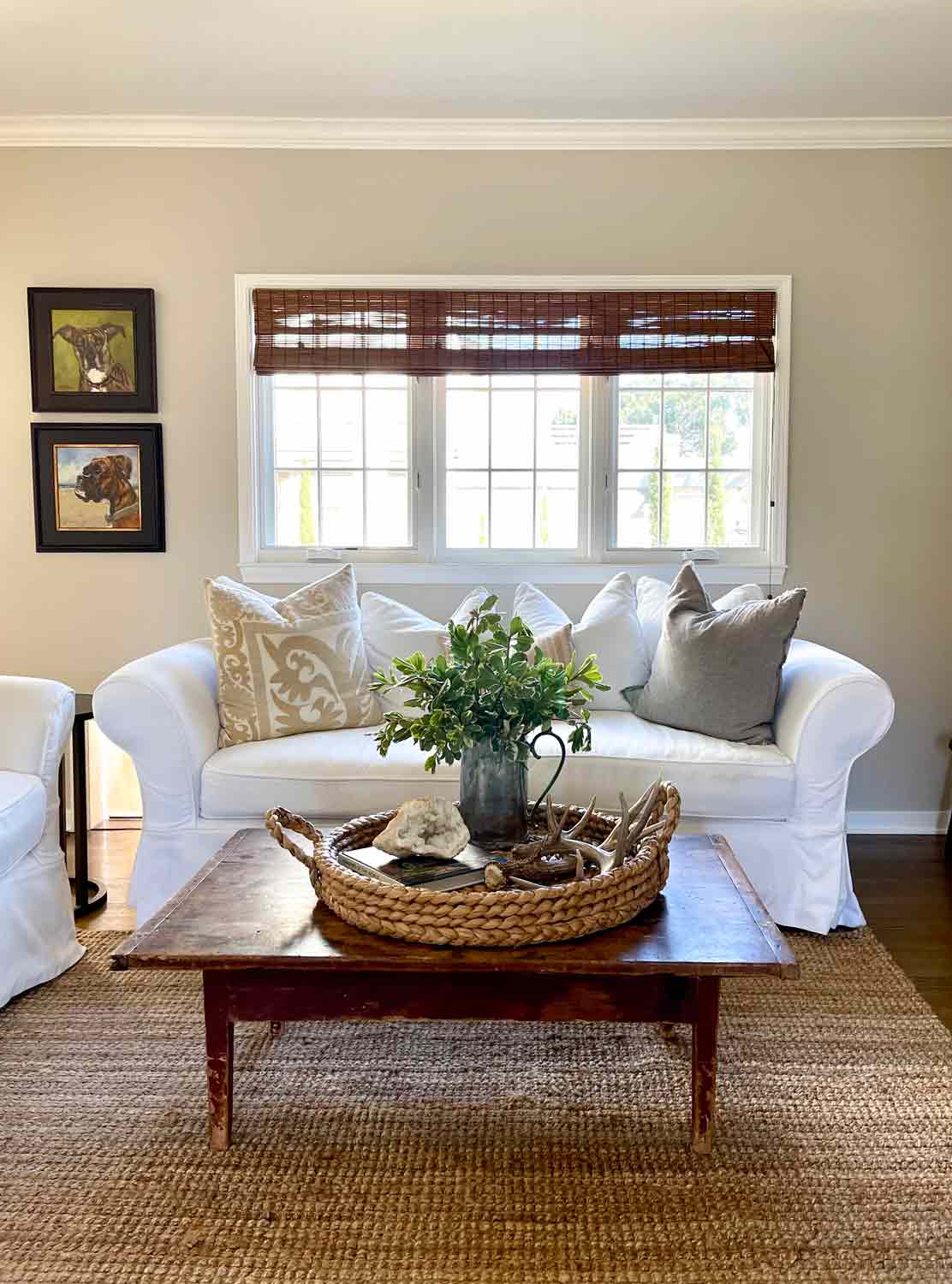
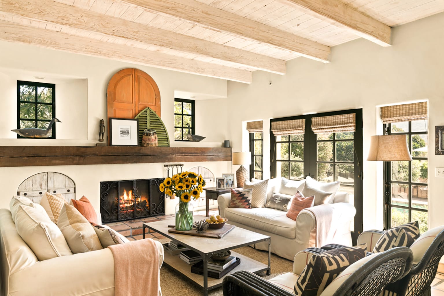
Cindy, can you speak about flooring. I love the look of the wide plank in the last photo. I am wanting to get rid of carpeting and replace it with something easy to care for and warm, if possible.
Cork, bamboo, wide plank wood or vinyl …. I am stymied by the options. Whatever I choose, I want it to be light in colour. Thank you.
I”m so dying to try out your suggestions! We have almost no direct light in our house, so I’m curious how the paints will do. Thanks for all the great info Cindy! 🧡
I love so many of the colors you’ve picked as your favorites Cindy! And I’ve been dying to try Halo – hoping that I can now because it looks so good in these spaces!
Thanks so much for having me join this one – it was a wonderful idea!!
Sheila
xo
When we moved in three decades ago I had BM paint to match my miniblinds (how telling is that?), when it came time to repaint I wanted a white that I liked (without mini blinds, thank you very much) that looked good back side (east) and the front side (west). I think a spent a year of my life (would love to have it back) looking for the “perfect” white. I didn’t want creamy, gray. greige or god forbid blue undertones. I gave up and being a Libra turned the wheel opposite and painted everything black. My bathroom with no natural light I painted BM Chantilly Lace. Long ago I had my office at work painted Simply White and loved it. White and where you live is a tricky monster.
Hi Patricia
As long as you still love the color that is fabulous!
This is an incredibly helpful guide. I love Edgecomb Grey but the friendly folk at Ace were completely baffled by halving it. This process wasn’t as simple as I’d hoped it would be.
On a side note, will you please share the color of your door and shutters?? I’ve been dying to ask but didn’t want to go way off topic.
Hi Didi
Got to Home Depot. They do the cheapest samples and they are very familiar with cutting a color in half.
Cindy,
I agree, I love neutrals and I really like the examples you’ve shared. This is a great topic, paint color is a challenge.
xo,
Karen
Thanks Karen paint is always a challenge for all of us!
I always enjoy seeing designer’s favorite paint colors and pin them for future reference. You are a designer I highly respect so having insight into your choices are ones I trust. It was fun to see some peaks into your lovely home that I don’t remember seeing previously. I just LOVE the hallway chest display! Thanks for the great advice!
Celia thank you so much for the kind words. That picture was taken by the talented John Granen . It appeared in Tuscan Style magazine a million years ago!
It looks different to me in every room!Looks like you cannot go wrong with it!
As you know I do not have one white wall but it is time to re-paint and all I’m hearing about is BM………paint!
Is that the Most commonly used brand?
I will pick up some color swatches soon!
XX
It does Elizabeth! That is the beauty of the color. It is way too tame for you pal!!
Cindy, The color in my bedroom gives me fits. Nothing reads right on the walls. I’ve used Kilz and nothing helps! I’m now obsessed with it. Left you a comment on my most recent Instagram post because I’d just read your IG post. xoxox, Brenda
Email me Brenda maybe I can help you!
My question is the same as Cindy’s. What does “cut in half” mean?
Hi Barbara
Thanks for your comment. Please see above. Feel free to ask any more questions.
Cindy, when you say ‘cut the Manchester Tan in half’…what are you cutting it in half with? What does this mean? Thanks!
Hi Linda
When you go to get your paint mixed at your paint store, tell them to cut it in half. They will only put have the amount of color in it. They do it all the time they will understand. It is a great color. I have used it on at least 7-10 projects.
I have never tried Edgecomb Gray. So good to hear and see how others use these neutrals. These are lovely examples, as usual, Cindy!
Thanks Carla for joining us. You always share such useful information!