
Six Unexpected Color Combinations That Actually Work (Even If You’d Never Pick Them on a Color Wheel)
I’ll admit it: for years I played it safe. Black with white. Gray and white. The occasional “wild” leap into camel-and-cream. Reliable, yes. Memorable? Not so much.What changed things for me wasn’t what was or is “on trend”, it was noticing that the outfits I got the most compliments on were never the ones where everything “matched” in the traditional sense. They were the ones where two colors I’d never have put together on purpose ended up looking like the most deliberate decision I’d made all week. So consider this your permission slip to raid your closet with fresh eyes.Let’s chat about six unexpected color combinations that actually work (even if you’d never pick them on a color wheel).
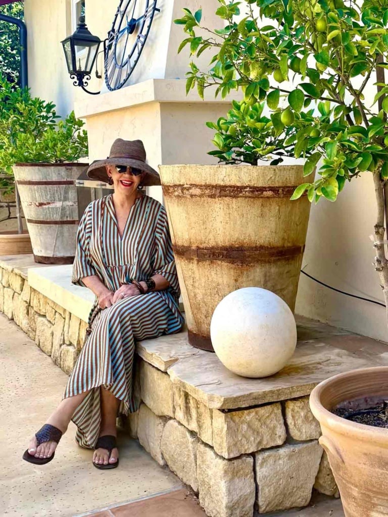
# 1. Aqua + Chartreuse
You often see turquoise mixed with gaspeite in Native American jewelry (one of my absolute faves). This is one of the punchiest unexpected combinations on the list and a new fave of mine. You have two cool-leaning colors that together feel almost tropical, like colors you would see mixed in the ocean at a certain time of day when the sun shines just right. To me this combo is calming, because both colors share that same fresh energy.
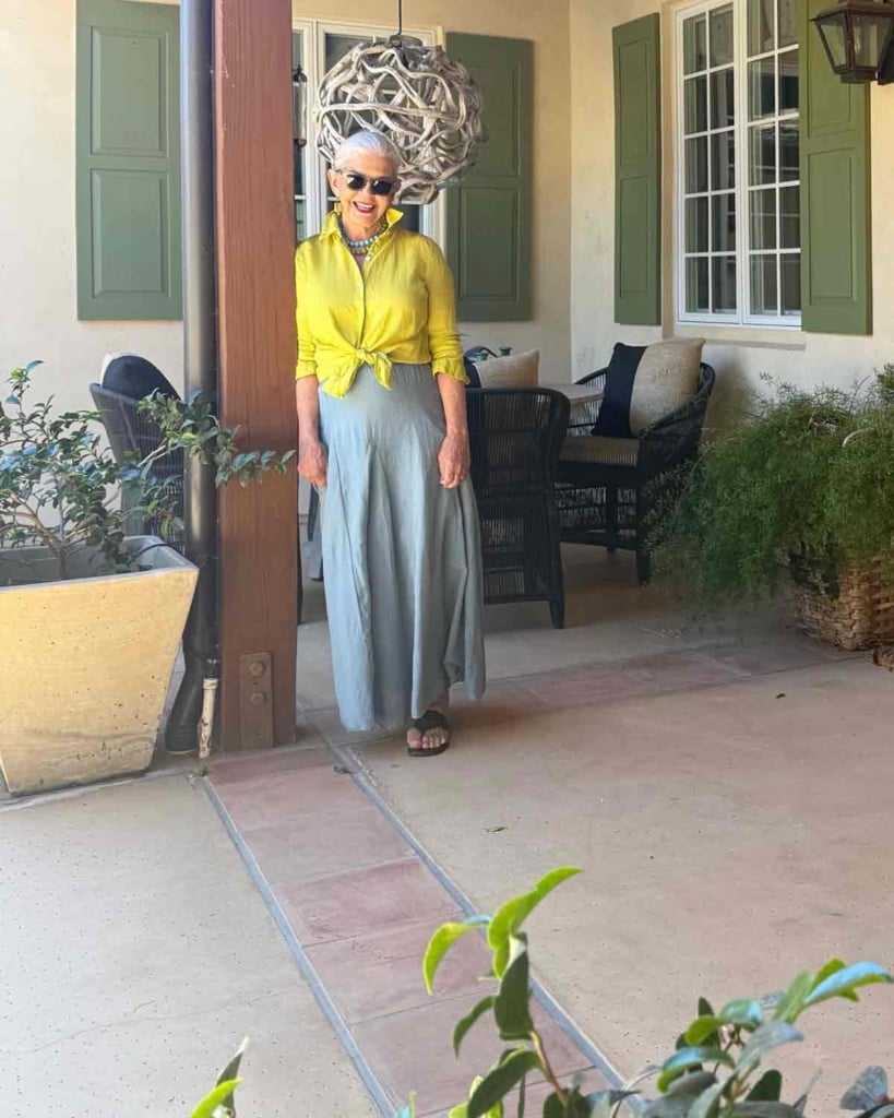
Let one color take the lead — Here I am wearing a turquoise lily skirt with a chartreuse linen shirt and brown sandals. This combination is especially fun for spring and summer. In this light the chartreuse appears more yellow. The combination is much prettier in person. I paired a favorite lily skit, margaux sandals, Jjill linen shirt and two necklaces from Bauble Bar. You could also pair a chartreuse linen shirt with powder blue jeans for a similar look.
Shop Aqua & Chartreuse
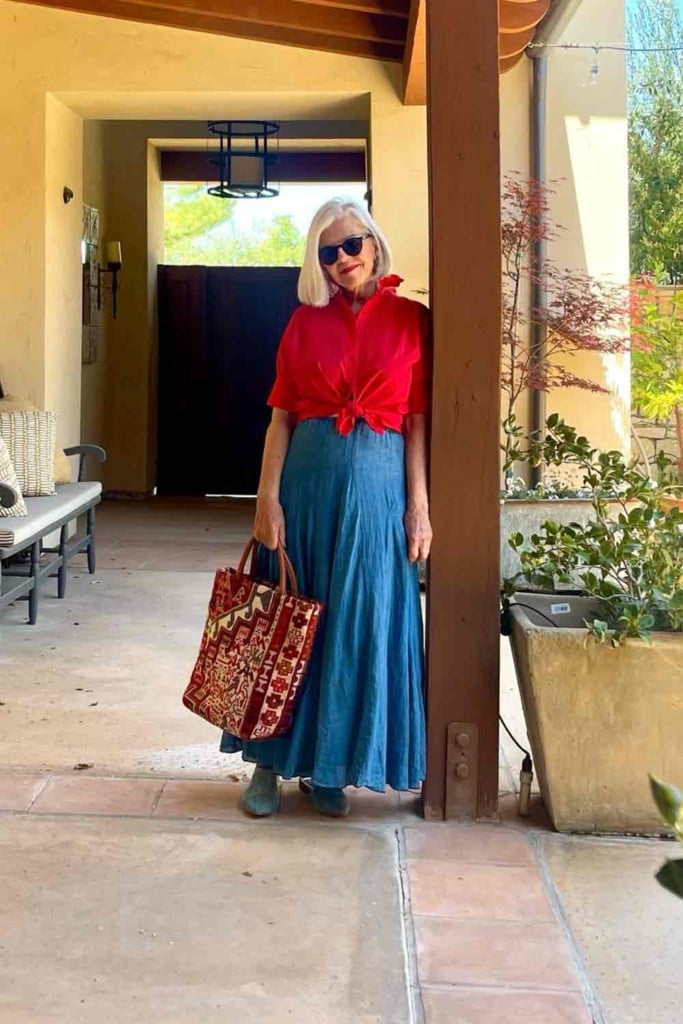
# 2. Blue + Red
This is the combination that stops people on the street , and it’s more versatile than it sounds, because “blue” here can mean anything from a bright primary blue to turquoise, and both work beautifully with red. A bright blue and red pairing is bold, graphic, and a little bit pop-artish. A turquoise and red pairing leans warmer and more summery, almost beachy.
Shop the Look
Color-block it: a blue top with red pants (or vice versa) is cleaner than mixing them in a print.
Shop the Look
This Natalie Martin pairing is actually turquoise but reads more blue in this photo. I kept it simple with red sandals and the bandana on the bag.
**How to wear it:**Wear a long line of color and keep accessories simple (one great necklace) so the two colors get to do the talking. For the turquoise version, simple silhouettes work best: a turquoise dress with red
Shop Red & Blue
# 3. Seafoam Green + Burgundy
This is one of my favorites precisely because it sounds like it shouldn’t work .A bright airy hue next to a deep warm one seems odd, but the contrast is what makes it interesting. It feels rich and a little unexpected, like a combination you’d spot in a great piece of art. It gives the turquoise in this list a little breathing room , seafoam green can be a bit fresher, and more tranquil than a bright pool color.
Honestly I would not have thought to try this combination. This Zara dress caught my eye. FYI I am wearing an XS and it is ample. I paired it with my woven leather sandals, tortoise accessories and IBeliv hat.
Shop Seafoam & Burgundy
If you are a zara girl you might also enjoy my post: 6 Zara Linen Separates That Create 10+ Outfits for Women Over 50
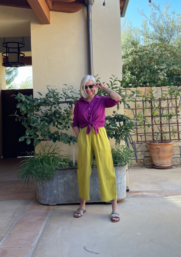
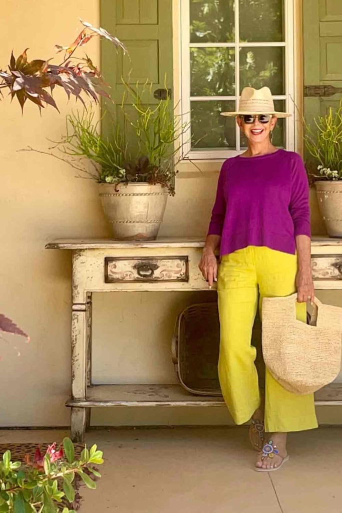
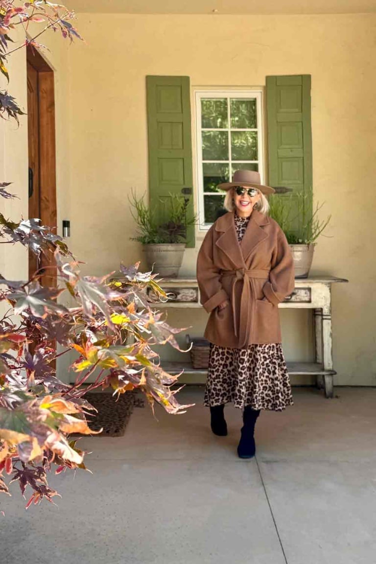
# 4. Chartreuse + Purple
These two sit close to opposite each other on the color wheel, which is exactly why the pairing has so much energy. Chartreuse can feel a little intimidating on its own, but purple gives it somewhere to land. I have been wearing this combo for years. It is another favorite of mine.
Shop the Chartreuse Purple Looks
Start small if you feel like this combination is too much. You could pair a chartreuse scarf or bag against a purple dress or sweater, then build up to larger blocks of each like I have here.
# 5. Green & Hot Pink
Green is having a real moment, and pairing a true, vibrant green with hot pink takes the combination from “color pairing” to “statement.” There’s an energy here that can feel almost tropical, like a garden in full bloom. The brightness of both colors means neither one has to do all the work. This one’s for you Kathy Sue!
Maria Delaorden sent me this fun skirt (I am wearing a 38). It fits beautifully through the waist and hips and is beautifully made. I paired it with an old CP Shades shirt similar linked below, great necklace from Bauble Bar and Etsy mules.
Shop Green & Pink
#6 Bonus Combo-Leopard & Pink
This one’s a slight departure from the rest of the list. I am pairing a print with a color rather than two solids, but it earns its place. Leopard print functions as a neutral in my book and many style circles, so hot pink against it reads as even more confident and graphic than it would against a solid. It’s less grounding and more look at me!
Here I paired the leopard dress from Natalie Martin (that you have seen styled many ways) with a bright fuschia scarf (also seen many times), tortoise accessories and black sandals (old madewell similar linked below)
Shop Leopard & Hot Pink
The real secret is confidence not color theory. Here are some other unlikely-but-working combos you could keep in your back pocket:
Pink + olive’s cousin, khaki + fuchsia — similar idea to olive + hot pink but with a slightly more neutral, “safari meets nightclub” feel.
Yellow + lavender — sounds like a baby shower, but a deep, mustard-leaning yellow with a dusty lavender (not pastel) reads as sophisticated rather than sweet.
Coral + navy — coral warms up navy considerably and feels coastal without being literal nautical stripes.
If you love color, youmight also enjoy this post Older and Bolder: Dont’ be Afraid to Add Color to Your Wardrobe. You can also find colorful outfit inspiration in this Sunday Fave Post.
Here’s what I’ve learned after years of experimenting with color: an unusual color combination only looks like a mistake if you wear it like one. The moment you commit, good posture, the right accessories, maybe a little lipstick to tie it together, it stops looking accidental and starts looking like style.
That’s really what building a Collected Wardrobe is about. It’s not having more clothes. It’s having pieces and combinations that feel unmistakably like you even if no one else would have thought to put them together. Own your own style.
So pick one combination from this list, dig through your closet, and see what you can create. If you land on a pairing you love, I’d love to hear about it. Leave a comment or tag me on Instagram. I’m always interested in collecting new combinations to try.


#3 – Yes! This “cherry” and “eau de Nil” lacquered tray convinced me that seafoam and burgundy are a great pairing! https://usa.addisonross.com/products/two-tone-scallop-tray-cherry-eau-de-nil-43-x-33cm-lacquer
Love the red and turquoise outfit. Where can I find the red pants and top?
Hi Sara
That is an older Eileen Fisher outfit. Thank you for bringing that to my attention. The shop widget was the wrong one I have fixed it now.
Hah as a winter I feel seen with all of these high contrast combos! Something must be going on because this summer I am really craving color! I wear a lot of these combos already, but there are great ideas here. I have been looking to my garden for color inspiration…that may be a whole new post!
Hi Sue
Yes! The garden is the best guide for contrast!!
This is so interesting and inspiring. I just purchased a large handbag with a zebra print. It is not my usual at all but is really nice. I was just thinking after reading the comments that Navajo and Hopi dressing is colorful at times and goes with the jewelry that is made of beautiful stones that compliment it. Thank you for working on this for us.
Hi Donnie
I treasure my Native American pieces!!
Loved all the color combinations. I like to wear mustard colored pants with a burgundy top. I think those two colors really complement each other.
Hi Kay
Yes I love that combo too!! Somewhere in the archives I have that combo with a lily skirt and mustard linen shirt!!
Cindy,
Loved this post!! I love color & you did very interesting combinations!
Hi Nancy
Thank you so much…I tried to come up with some new ones that appealed to me!
I had to laugh when I started reading this because your first color combo is what I have on, aqua and chartreuse. I love all the colors you listed because I’m a paintbox Spring. I never wear black because it sucks the life out of my face. Give me bright colors every time.❤️
Hi Pam
I just discovered that combo and it is one of my favorites!! I love chartreuse. I didn’t wear it for the longest time after my hair turned white…now I wear it anyway because I love it!
I think some of these color combinations are just great! For many years after my hair turned from brown to gray, I opted for an easy black and white and gray wardrobe, thinking it made life simple and was complementary to my hair, eyes, skin color, etc. However, over the last few years as I am approaching 70, I’m realizing just how much I need and love color…in fact, red has always been my favorite! Thanks for the inspiring ideas for styles and colors!
Hi Paula
I couldn’t agree more. I still often opt for neutrals when I travel (for simplicity) but I am loving color more and more as well.
So many great ideas! Going to have to try them. Some of my recent favorites are emerald green with leopard, your featured purple with turquoise, (something about it makes turquoise jewelry sing!), burgundy with rose pink, denim blue with kelly green, and chocolate brown with robin egg blue. So much fun to stretch out creatively and try new color combos. Excellent post, once again.
Hi Kim
Great color combos that you are trying. The ones I shared are more in my wheelhouse but I love all your ideas. I agree with the purple and turquoise combo. I am often tempted by earrings that are a mix of purple and turquoise. I look terrible in brown even though I wear it on occassion. It is a stretch for me to wear anything pink, it has to be just right!!
Are your bead necklaces 14, 20, or 22 mm?
Thank you,
Vickie
I have the same question. Love combination!
Hi Vicki
Mine are 20″ thank you for asking!!
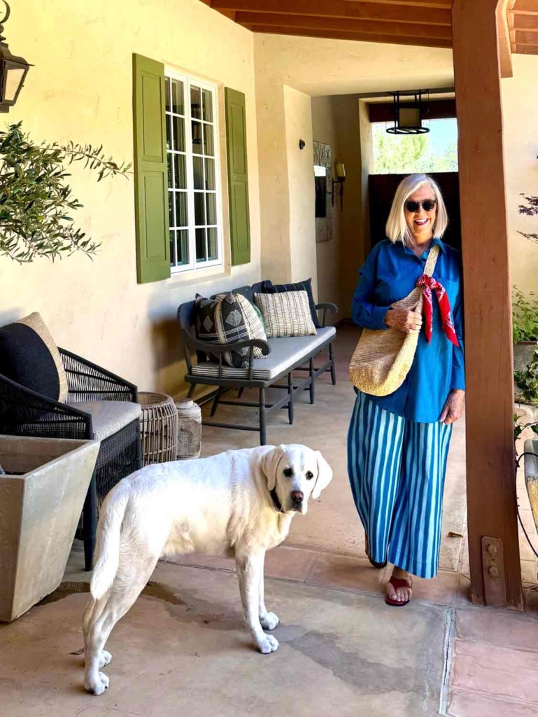
Wonderful! You look great in each outfit. I really like the blue striped pants and the blue shirt!
Hi TJ
I love that outfit too. It photographs “bluer” than it is in person
I live in the southwest and in addition to red, I love to wear magenta or eggplant with my turquoise jewelry. It love your purple and chartreuse outfits.
Hi Nancy
I agree purple and eggplant are great additions to turquoise! I have a pic in the post that I linked to with a magenta shirt and turquoise necklace.
From Brenda Kinsel: burgundy and orange.
Hi Amy
Brenda was a genius with color! Sure miss her insight…
Love red and blue together. You have some great color outfits today.
Hi Cristi
Great for the summer holidays!! Thank you!
I love these color combinations. When my son got married, I wore a dupioni silk, off the shoulder gown with a sash and shawl. The gown was tangerine with a fuchsia sash, and the shawl was reversible with tangerine on one side, with fuchsia on the other. When I was placing the order, even the proprietor of the shop was trying to talk me out of those colors. She was trying to convince me to go with sage green for the sash, and shawl. I held my ground. When the gown came in, she called to tell me and to exclaim that she couldn’t get over how beautiful it was. Got numerous compliments that day, even from complete strangers. I find that as I’m getting older, I’m getting bolder. I refuse to fade into the background.
Thank god you didn’t let that salesperson sway you! When you know you know…She obviously didn’t ha ha!!
I am all in. I have always loved color and pattern. That’s why can’t/dont accessorize as well as you. My clothes are too busy… the accessories get lost. I am learning from you! 💋
You don’t need to learn a thing from me!! As Juliet says one accessory at a time!!
I checked in on your Gap recommendations and realized the jeans I just ordered this weekend were now on even a better sale. Thanks to your tip, I contacted Gap and got the new sale price on the jeans that haven’t been delivered yet.
It pays to read your whole newsletter! Thanks.
Hi PJ
I try to keep on top of the sales but I miss some! Zac Posen has really taken Gap to new heights!
I’m headed into my closet to look for some colorful combinations. You’ve inspired me. I notice when I wear grass green, I look and feel very confident and my green eyes are more vivid. Summer is certainly a great season to experiment with color.
Absolutely PJ!!