
Color, Do You Love it or Loathe It?
Happy Sunday everyone! As usual, I am joining Mary Ann and Annie for some Sunday fun. I have had Summer here all week and we have had a blast. The weather has been toasty so we have had a lot of pool time. Let’s talk color this week. Color, Do You Love it or Loathe it?
THE COLORFUL WORLD OF ARTIST LESLIE TOMS
“Color light and luscious painterly brushstrokes” characterize the work of Sacramento-based artist Leslie Toms. Leslie is a long-time reader and regular commenter here on the blog. I have always enjoyed Leslie’s thoughtful comments and recently discovered she is a respected artist whose work is highly sought after. I asked Leslie a few weeks ago if I could feature her on my Sunday favorites and she agreed. You can find Leslie’s available paintings and galleries where you can find her work on her website here. You can follow Leslie on Instagram here.
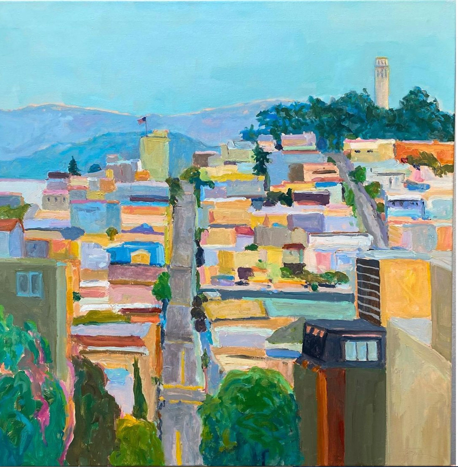
I love this recent commissioned painting of San Francisco. Prints will be available soon.
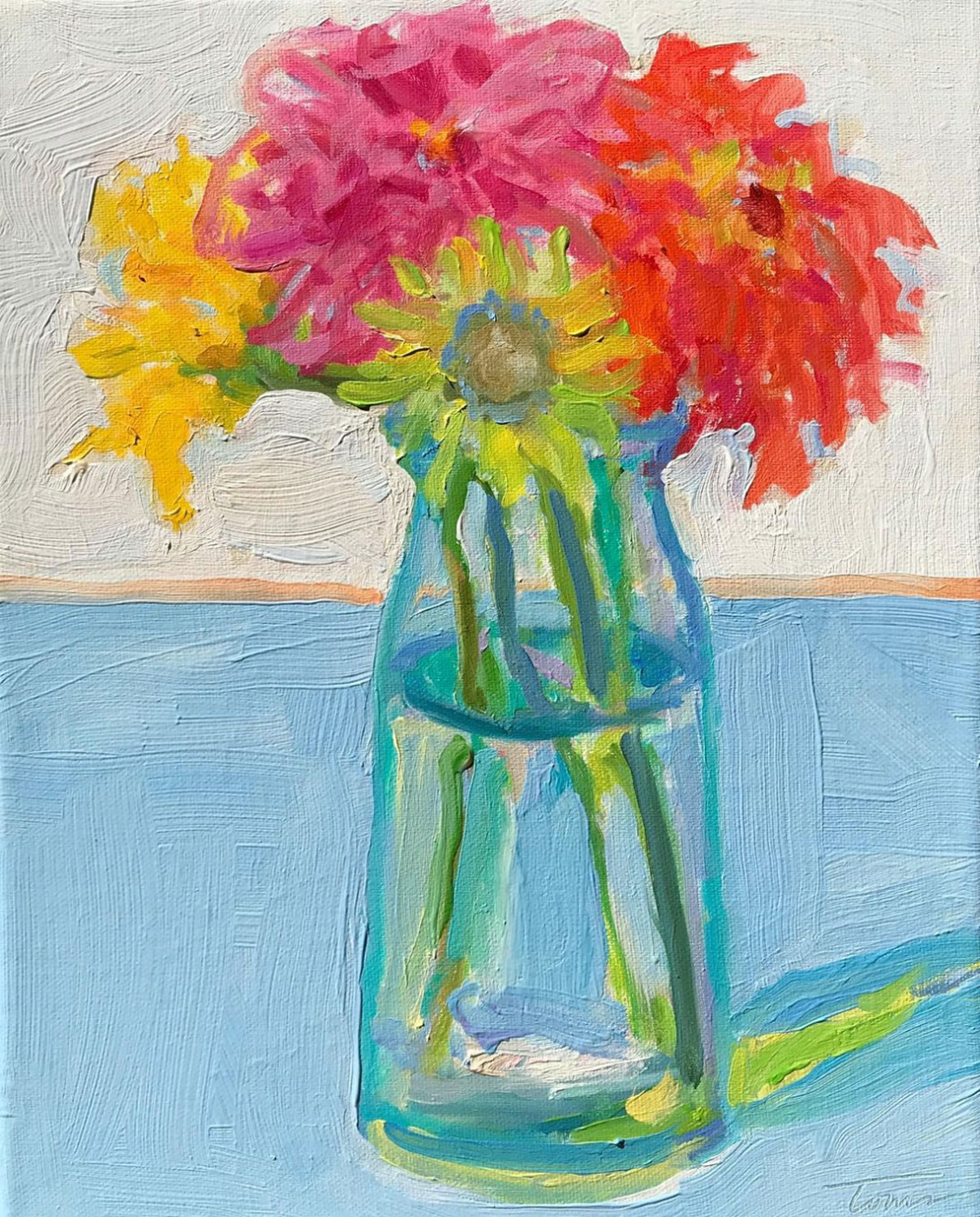
This gorgeous still life makes my heart skip a beat.
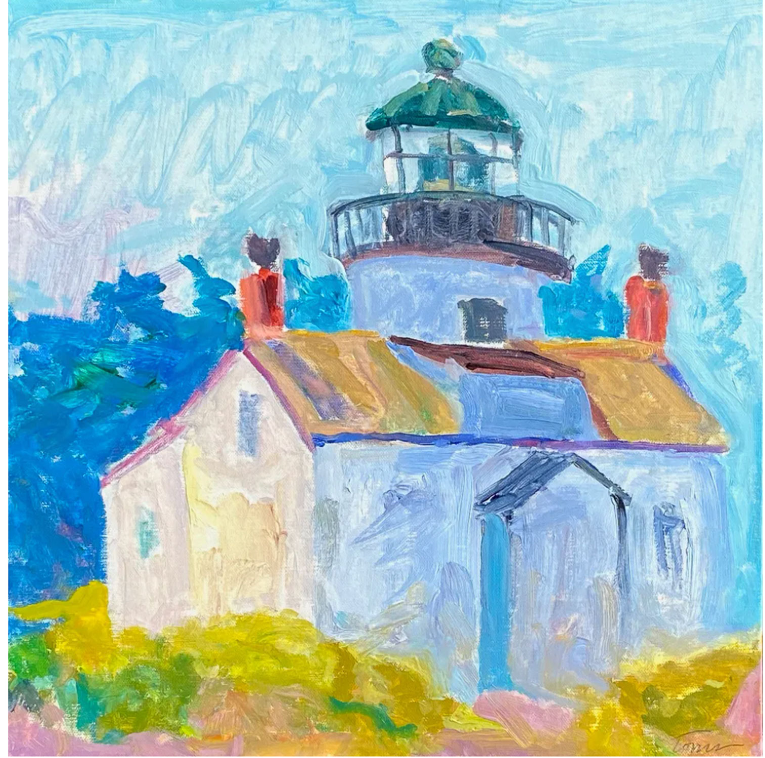
I love this painting of the Pacific Grove Lighthouse. It is a part of her Monterey series.
Last but not least, I am beyond touched that Leslie painted my former garden as a gift to me. I can’t wait to receive it and I am pretty sure I know where I am going to hang it. Isn’t it lovely?

AARP FOUR WARNING SIGNS OF MELANOMA YOU MIGHT MISS
Nearly 100,000 Americans are diagnosed with melanoma each year, making it one of the most common types of cancer in the U.S., especially among older adults who have endured decades of sun exposure. Yikes that’s us. Check out this article on AARP (they have such good info) on the signs of melanoma we might miss.
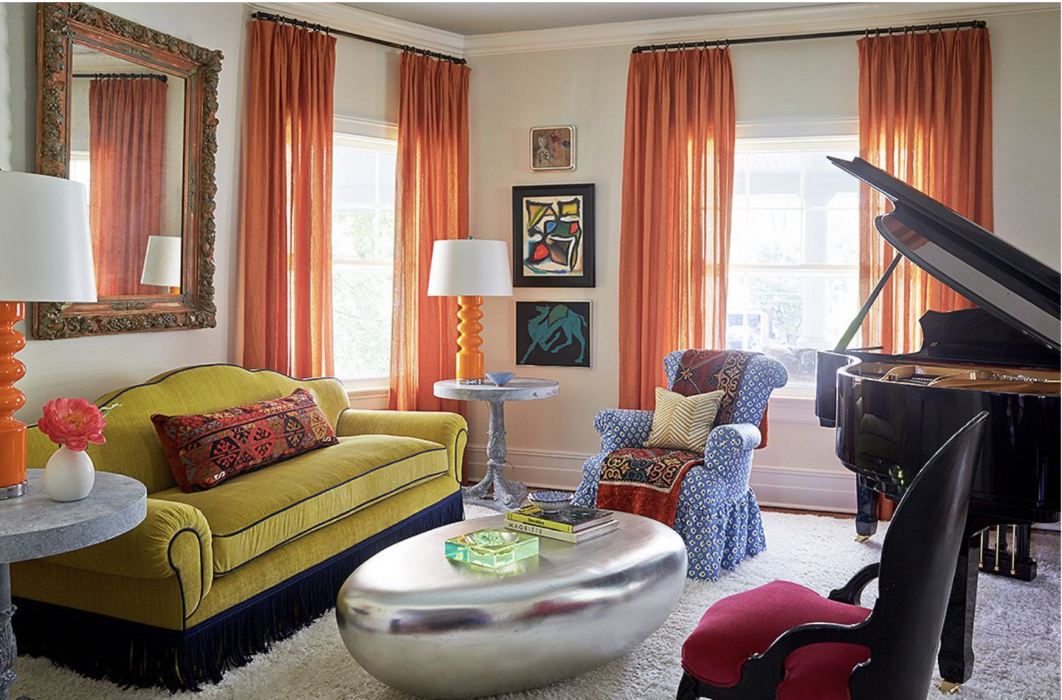
ONE KINGS LANE SIX LESSONS IN COLOR FROM PATRICK MELE
Patrick Mele is no stranger to color. He is a master at combining bold colors in his designs. In this One’s Kings Lane article Patrick Mele shares his six lessons in color. Article written by Allison Hall, Photos by Tony Vu, Styled by Michele Wong.
I am crazy over this entry. I would never go this bold personally because I would tire of it, but it is just fabulous, isn’t it?
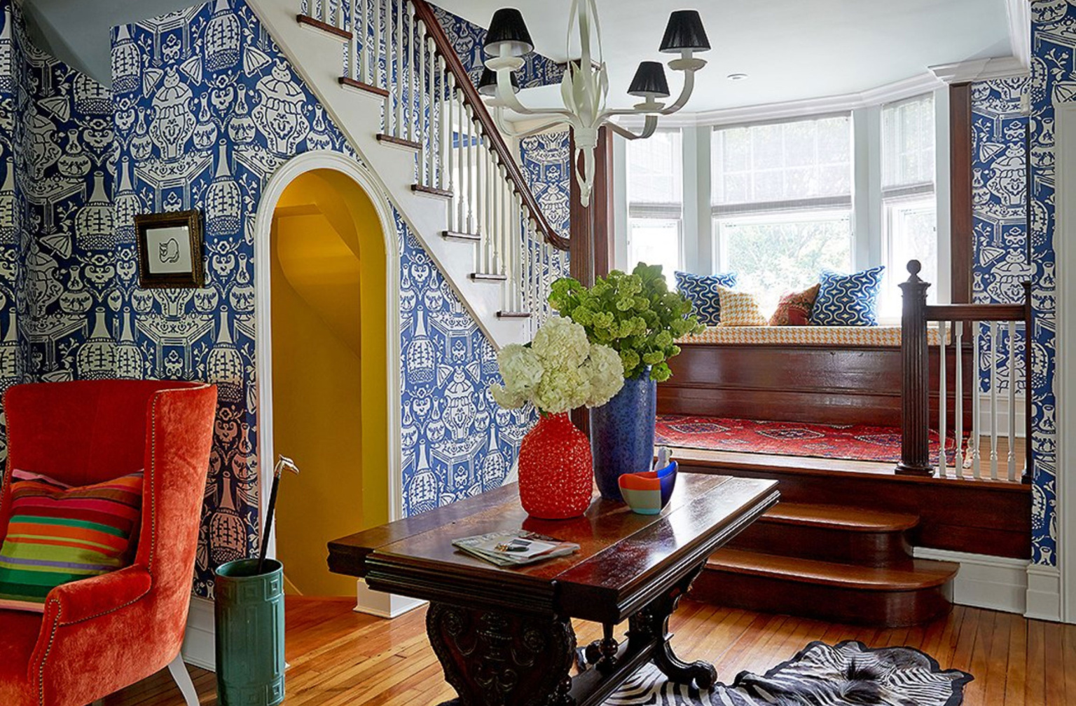
Love the soothing feeling of this living space filled with color, but a light hand with pattern.
TAN FRANCE MASTERCLASS ON HOW TO MATCH CLOTHES USING THE COLOR WHEEL
Have you tried any of these Masterclasses? I have heard good things, but have not tried them. I thought this class from Tan France might be helpful to those of you who are interested in how to combine colors in your wardrobe.

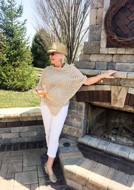
OUTFIT OF THE WEEK
I know this post is all about color but I could not find anything colorful this week that floated my boat so to speak. I Have had my eye on this dress from J-Crew. It is on sale and would be great for the last dog days of Summer. I love anything smocked. I don’t love the slit but I think that could be easily fixed. I love the wrap sandals from Sam Edelman and the accessories from Etsy and Amazon are very inexpensive.

SHOP OUTFIT OF THE WEEK

SALES OF NOTE
If you love Boden they are having a huge sale up to 50% off selected items. Almost everything is on sale.
Ballard Designs 20% off all Outdoor
Including my chairs and sofa that I love so much here.
J Crew Up to 50% women’s summer styles, up to 50% off swim, up to 50% men’s and kids


Love color but I tend to be cautious, neutrals with pops of color. Leslie’s artwork is beautiful! Great info as always, and a pretty dress too!
Hi Barb
I am in your same camp. Isn’t Leslie’s work wonderful!!
Thanks Cindy for sharing Leslie Tom’s beautiful work. Being a San Francisco native, I immediately purchased her print of
San Francisco. I moved to south Orange County 3 years ago and really miss the area. I’ve already chosen the perfect spot for it’s new home!
Nancy M.
Hi Nancy
I am so glad that you purchased one of her prints. I know you will enjoy it.
Leslie’s paintings are just wonderful! We tend to purchase art and let the furniture gently fade. Now, though, I have two chairs that must be reupholstered or replaced — decisions, decisions. It’s also time to abandon an old Oriental, and I’m going for jute or something — much mre neutral. The AARP magazine is really interesting — I steal my husband’s copy.
Cindy! I love that artist, and yes to color! It’s so beautiful in these muted tones. Reading your post and getting to the article on skin cancer derailed my morning, but thank you!!!!
Hi Annie
The black and white girl loves color!
Color, Color … give me all the color! Mostly in my house, I’m more neutral in my clothes style. But every once in a while … a pop of color. Leslie’s work is fabulous. I love it. Particularly the piece with the vase of flowers. Oh my, swoon. Also love that smocked dress … one can never have too many summer dresses is my motto this summer. xo
Hi Juliet
I think that vase of flowers would look beautiful in Snowberry!
Leslie’s painting are gorgeous I love them too. I will read the lessons in color.. I could probably add more! What a lovely look and the bag too.
Hi Kim
I agree Leslie’s work is just wonderful! I could always add more color as well!!
I love color. Never have been a wallpaper person, I want my own collection of stuff on walls. Like paintings and sconces. Neutral like all whites is pretty to look at in magazines but it would be boring to me. I know Summer enjoyed that pool with you.
Hi Nancy
Your comment resonated with me. I never really thought about it, but I think that is why I am not a wallpaper person. I want my own collections on my walls. I had a blast with Summer but I am pooped!
I do love color, but I’m still a neutral gal at heart. But being neutral with the main components of your home means you can bring in vibrant color in smaller doses like pillows and artwork. Like you, I love to see it done by talented designers in the pages of magazines or books but I know I would get tired of it quickly. As always, I love your Sunday favs blog and all the blogs in between.
Hi Gail
I think we are on the same team. I like my upholstered pieces neutral so that I can add color in my accessories and art.
LOVE Leslie’s paintings! Henri Matisse and the south of France come to mind. I decorate with neutral furnishings (except for the leopard fringed chair in the den) and change paintings, pillows and accessories for spring/summer and fall/winter so I don’t get bored. I love color and play with it in my mosaics and in fashion., but that entry is overwhelming for me. I could be in the multi-colored room longer, but my eye still would like more patterns that tie the colors together. Like Leslie’s SF painting, my eye is delighting in the images and colors in PBS’ Hotel Portofino. It may be a glorified soap, but the settings (Portofino and various villages in Croatia) are eye candy that lifts my low-ish spirit in this difficult time.
Hi Sheila Merle
You are so right. Many of Leslie’s paintings feature Italy, and the South of France. I love her work. These times are perplexing, aren’t they?
I am in the neutral palette for my house and furnishings but pick up
color in our art work. I think it makes the art work stand out without
clashes. All that vibrant color on walls and furniture and drapes
would not be for me but can see how others might gravitate to them.
No vibrant colors or prints in clothes either! Pick up that in accessories
usually! Sometimes I try them on to change things up but always say
thats not me and not comfortable in them so I stick to my neutrals!😂
I really like Leslie’s work , and the painting she did for you will be wonderful!
Hi Char
I agree 100% with your statement. The former owners of this home had a wonderful art collection. It was the star and the walls were/remain white.
I do not loathe color but I love white and neutrals with touches of green. It is my color of choice for my home and clothes. I find it calming & soothing. It was such a confidence booster to find designer Leanne Ann Ford who isn’t afraid of whites.
Hi Margarita
I completely agree with you about the color green. To me, it is a neutral because it is everywhere in nature. It is calming and you are right Leanne Ford is wonderful
Hi Cindy,
I love your posts and look forward to reading them! I especially loved today’s post: AARP FOUR WARNING SIGNS OF MELANOMA! My mom developed Melanoma in her eye when my two kids were still in elementary school. Fortunately one of the few doctors at the time who worked with patients who had melanoma in the eye, was located in San Francisco, close to home. My mom had her eye removed and lived 8 more years!
Thank you for your lovely posts on fashion and gardening!
Nancy
Hi Nancy
Now that I am an official member of AARP I find they have so much good information on the site. So lucky that your mother got help.
Hi Cindy – I have followed Leslie Toms work for years through Nancy Dobbs Gallery. It is so lyrical and fun!
Hi Pat
Isn’t Leslie’s work wonderful? I feel so fortunate that she reads my little blog!
I’m in the neutral corner. My house is decorated in neutrals and my closet too. Paintings are my pop of colour. I think being surrounded by creams, beige, taupe & white makes the paintings stand out even more. I could not live in a riot of color but understand to some vibrant color gives them energy and happiness.
Hi Joanna
Absolutely completely agree with you. For those of us who love art, white walls and neutrals just work.
Love all the color, especially the flowers in vase. Your posts are always so inspiring. Thanks!
Hi Linda
Isn’t that still life to die for. Thank you so much for weighing in!! So appreciate it.
Put me in the color column. Actually I think I am more correctly a red and leopard are neutrals kind of girl. Love pattern. My house is like my closet plenty of black and white with color and pattern. Love the painting of your former home. I always thought the photographs looked like paintings. I have a drawing of my late MIL’s house. She lived across the street from a park. One day a young woman came to her door and handed her the drawing. She loved the lines of the home and made the drawing. Every day I see it, it makes me smile. How a little act of kindness meant so much.
Hi Patricia
Of course, I would put you in the color column. I adore that story about your MIL and that you are enjoying it to this day.
COLOR BABY! More is more for me. My home is done in mostly blues and oranges.
I have always worn color too – and find that color always makes me look better than black and white. But alas – I wear black and white most of the time! Thanks for all the link goodness and I’m getting that black dress. Love. It.
Happy Sunday Cindy! ❤️
Hi Gray
I think color is better on those of us who are silver-haired, but I fight between vibrant color and black. Maybe if I would lose a few pounds and get back to my normal weight I would give up the black!!
This post certainly brightened my day!! Now off to read about skin cancer!
Hi Mary Ann
Ha ha…color to skin cancer….
I am more of a low-keyed color person. Earthy colors. Tried to go with the English Cottage once and failed completely. Give me terra cotta, cream, sage/moss greens, and California sky-blue. But those paintings by Leslie Toms are stunning. So uplifting and happy. Off to the garden I go after your inspiring post this week on container gardening! Have a great week. xoxo-holly
Hi Holly
Leslie’s paintings are the shot in the arm we need right now so to speak. I love all the colors you covet as well and we share a love of gardening as well.
I love colors and find I always gravitate towards color vs neutrals. My home is done in tones of aqua, yellow with pops of red…not for everyone but sure makes me feel more cheerful…and my closet is rich in colors.
Hi Pat
Don’t you think the beauty of being our age is that we know what we like and we are comfortable with it. I waiver now and then, but for the most part know what I like.
Hi Cindy,
What fun. Grandkid sleepovers are the best.
I like color in moderation for my home. Clothing wise, after COVID I chose to have more color in my wardrobe, so I guess I’m fickle where color is concerned. I loved the image of the blue and white wallpapered room, but like you, I tend to tire of something so bold. As always, I thoroughly enjoy your Sunday posts.
Happy summer.
xo,
Karen B.
Hi Karen
Karen we are on the same page, with grandchildren, gardening and color!