
Design Ed-Katie Ridder
I have decided to start a new series called Design Ed. I occasionally feature designers whose work I admire. I thought we could take it one step further and see what we can learn from each of them. When I begin a project I look to designers whose work I respect. I find that some designers are just “good” at a particular thing. Sometimes it is even hard to define. I don’t necessarily love everything they do but there is something about their work that just “gets me”. Katie Ridder is one of those.
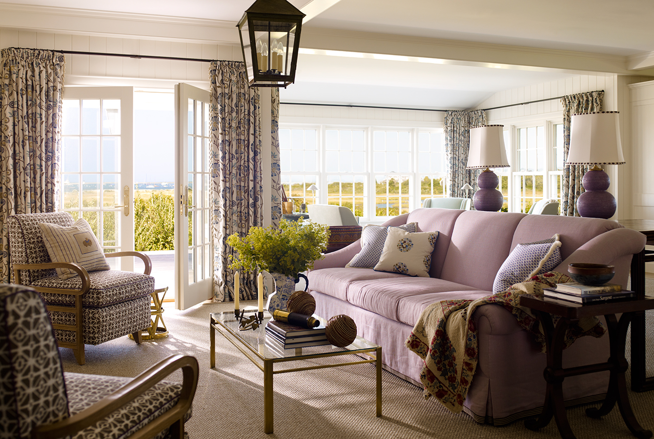
First off her interiors are gorgeous. They make you feel good. She is bolder than I in her choice of color and pattern. But her playful style of combining these with fine antiques make her traditional interiors fresh and alive. Case in point here the use of lavender. I am guessing the owner loved it. Katie made it work by playing it down. It isn’t in your face.
In this entry, the bold pattern gives the beautiful antiques a life of their own.
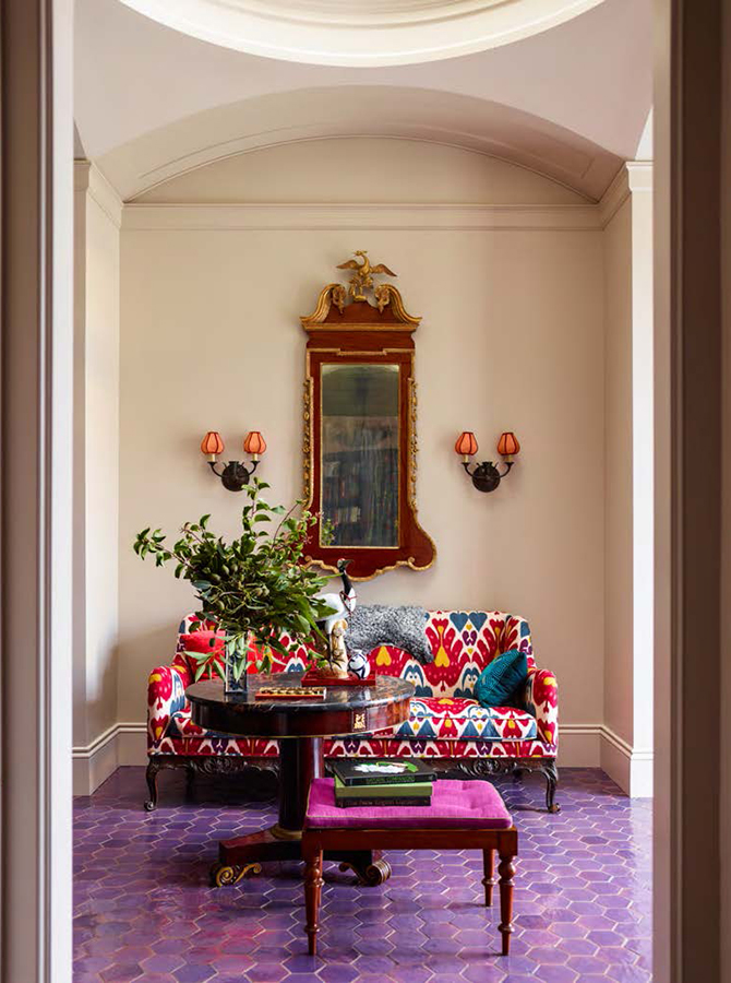
Katie Ridder Millbrook Entry
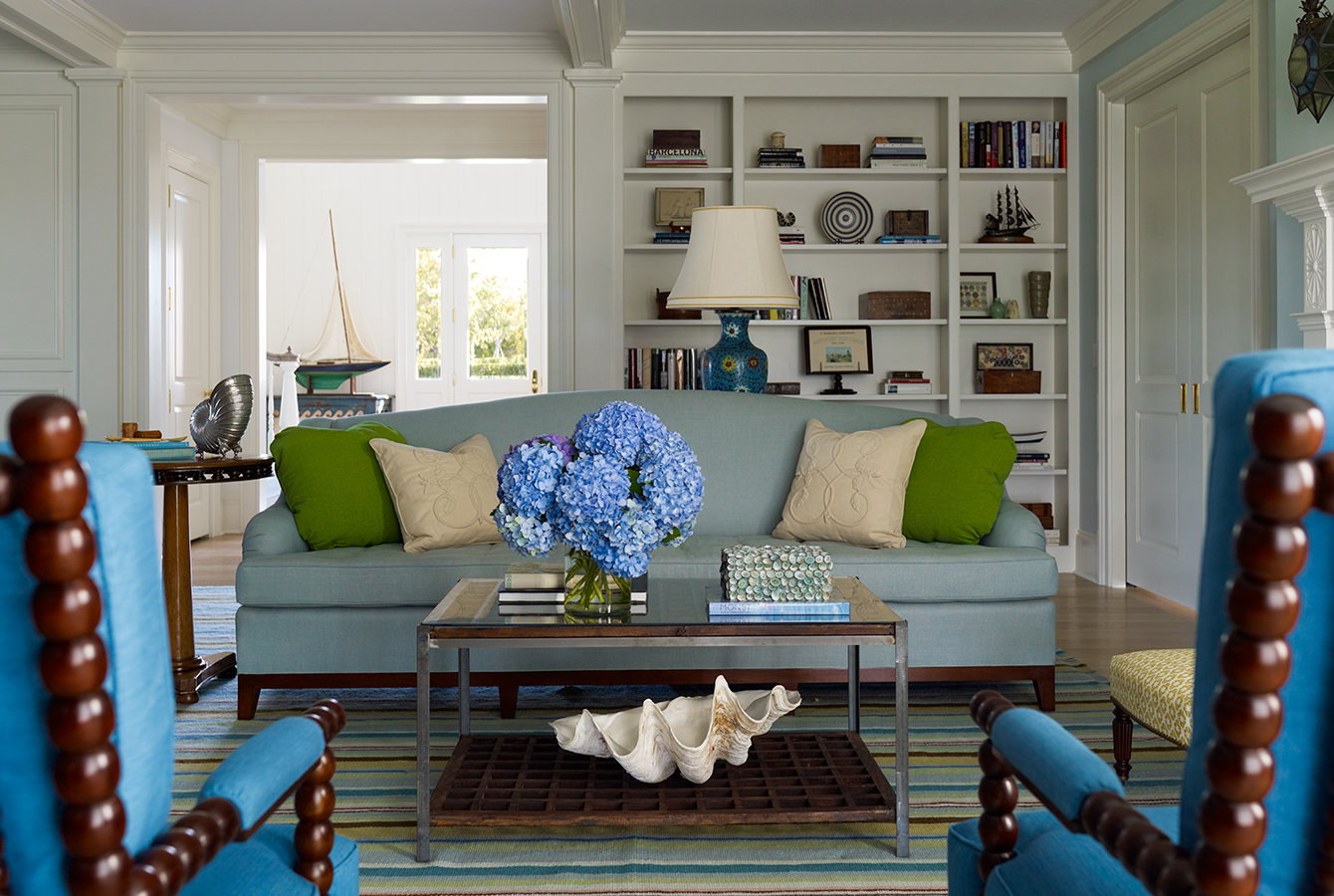
Here blue, a favorite of hers, predominates. It doesn’t overwhelm because all of the beautiful millwork is dead white and the accessories are kept to a minimum.
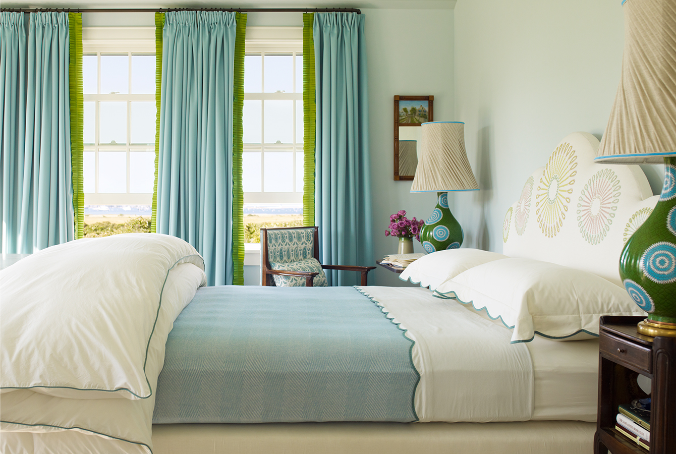
Here this lovely bedroom gets its color pallet from the sea outside the window.
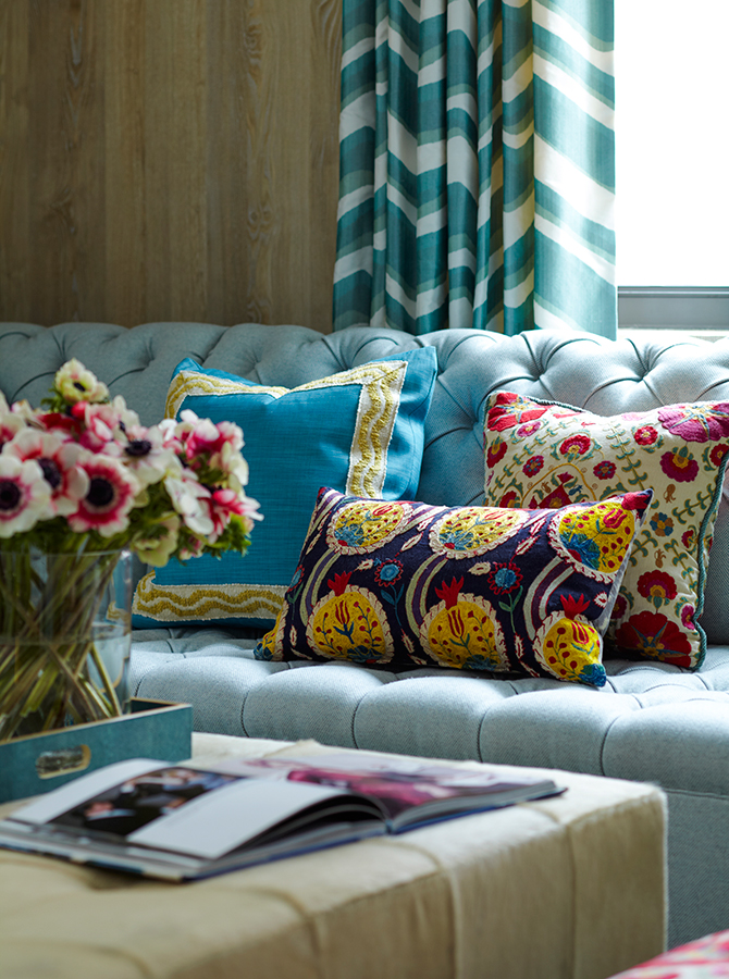
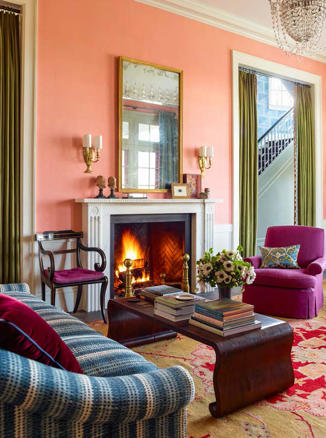
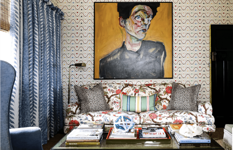
This room is not a personal favorite but note how skillfully she has mixed so many colors. Why does it work? Again the scale of the room can handle it, she doesn’t overdo the accessories, and the lighthearted color scheme breathes life into the antique pieces.
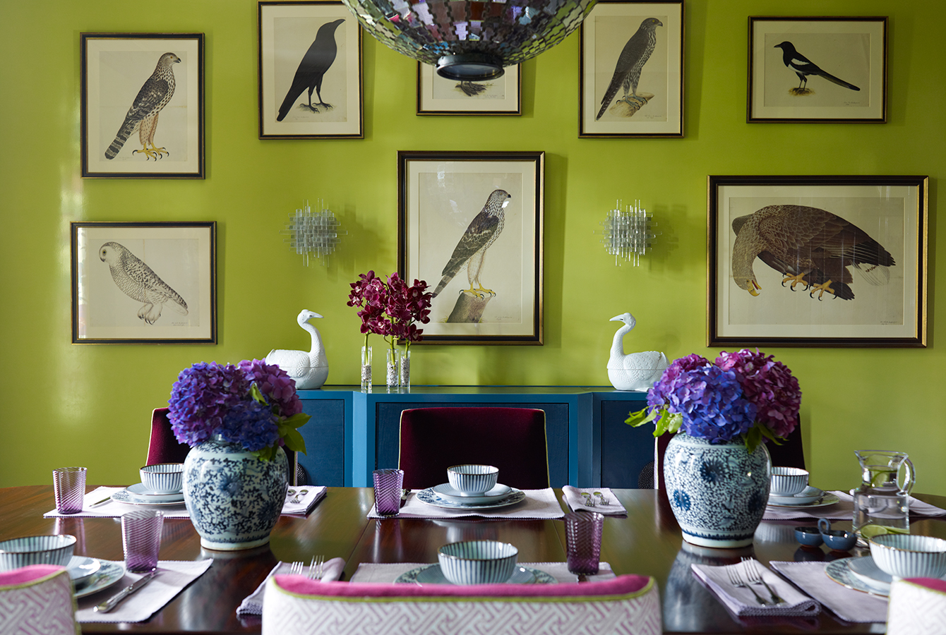
This dining room is a favorite of mine. We painted the walls of the Pour House a similar color. The simple gallery wall of vintage bird prints is what makes the room rock in my humble opinion.
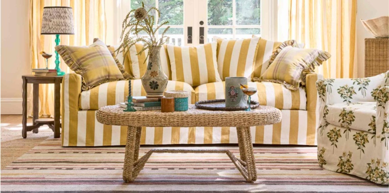
The softer side of Katie.
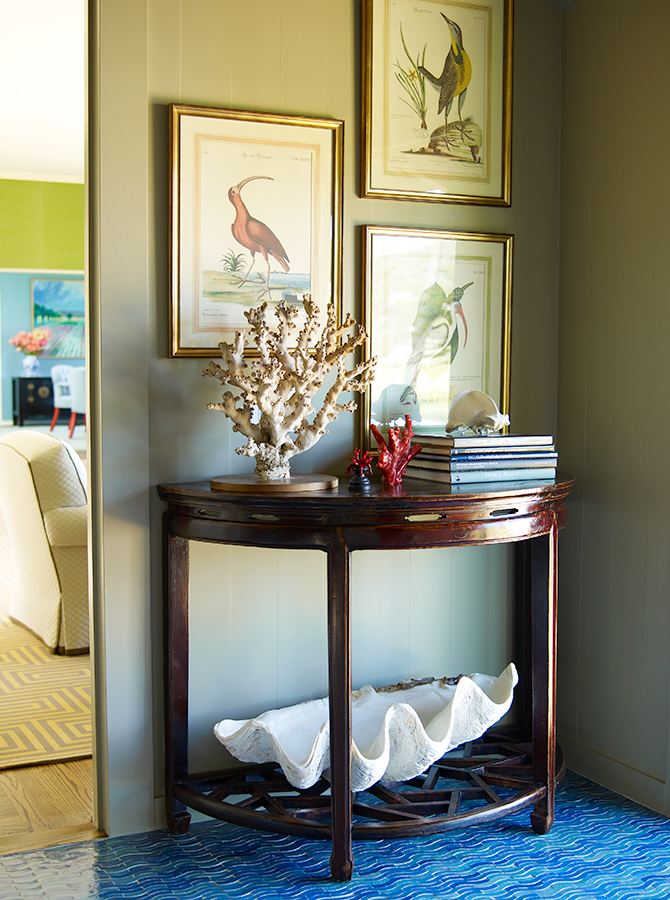
This vignette is from a local project in Pebble Beach. I love how she took this little corner and honored the beach location with shorebird prints and coral and shells.
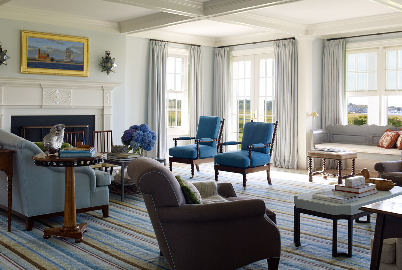
These last two photos are also from her Nantucket Project (my favorite in her portfolio). This is a larger shot of the room above. I adore how this color pallet brings the outside in.
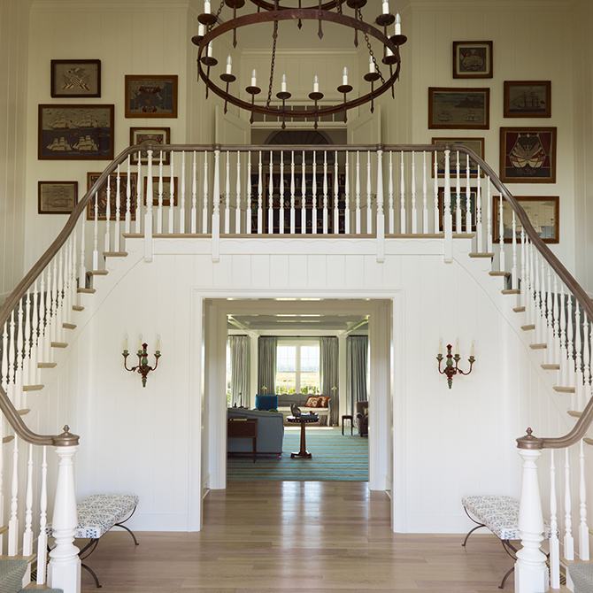
This is the staircase in the same home. She left it neutral (unusual for her) The art on the landing does the talking.
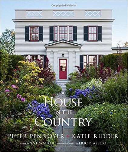
Do you love Katie’s work as much as I? If so what do you love and why? If you would like to see more of her lovely interiors, go to Amazon for her latest book House in the Country. The book tells the story of her own home in Millbrook New York which she shares with her husband noted architect Peter Penoyer.
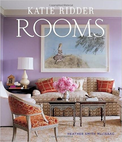
Katie’s first book Rooms also found on Amazon has become a standard in the design industry. A must-have for anyone who appreciates color and pattern.
All pictures are from Katie’s portfolio
Dont forget to stop by on Thursday for another installment of Ageless Style.


LOVE THE GREEN with the BIRD PRINTS!
COLOR ALWAYS make THE ART POP!
YOU BETTER LEAVE TIME TO BE A GRANNY!!!!!!!!!!!!!!!!!!!
XX
Cindy-You have built such a lovely website of well-chosen subjects and photos! One thing I’d love to see you change though is the incorrect use of the word “pallet”. That means a humble bed on the floor, or in a warehouse or shipping usage, a huge tray to stack and move many items. Perhaps you are looking for the word “palette” as in the hand-held tray artists use to array and mix their paints.
Hi Cindy! What a fun series to look forward to.
Love Katie’s aesthetic and marvel at her color combinations, the one with the purple floor tile is smashingly good! Have noticed she travels to Morocco and wondering if some of that inspiration derives from there…..whatever, it works!
debra
Cindy,
Katie has been a favorite of mine ! I always love her mix of colors that no one else uses. Each of her rooms always look so beautiful because of her mix of objects as well as unmatched pattern. I will look for her book. I think Tony Ridder was her dad? I’d see him when I was working at the Mercury News. Nice family. Love this series! I’d love to know more about designers!
xo Kim
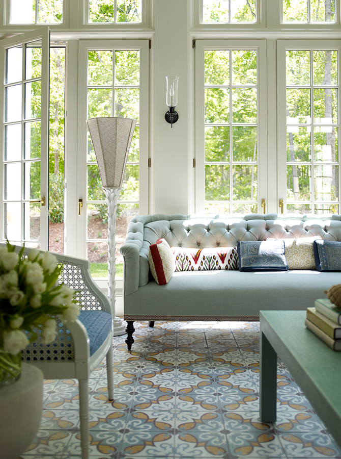
Thank you for doing this series Cindy! You have impeccable taste so whomever you choose to feature will be beyond great. Love that Katie Ridder sunroom!
xo kelley 😉